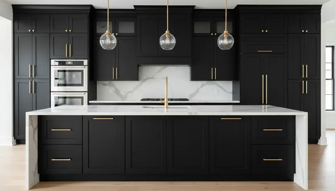
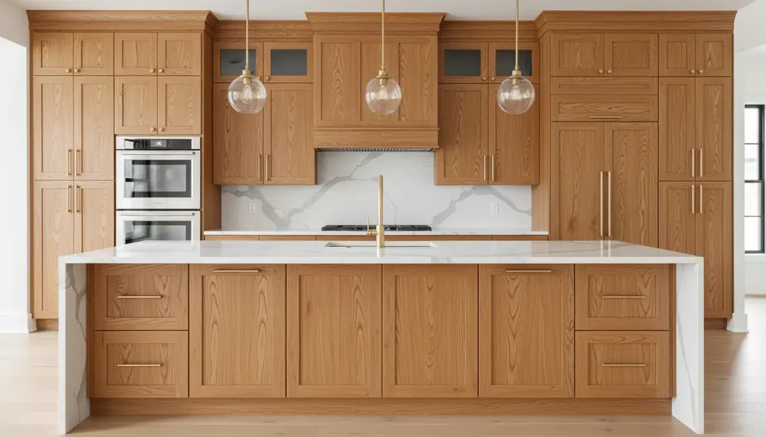
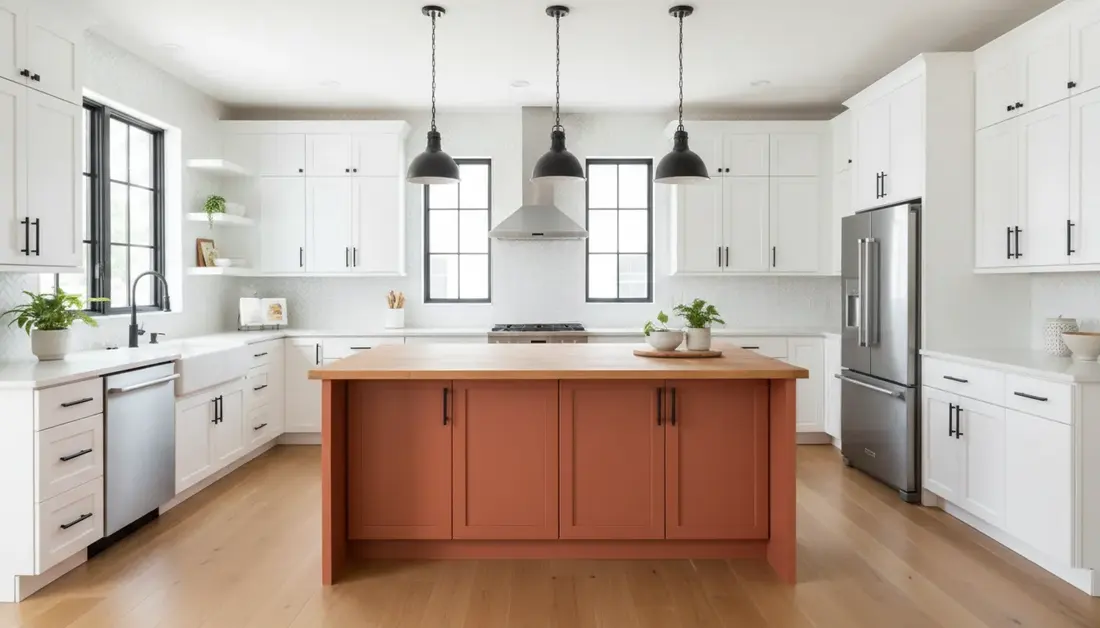
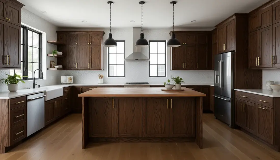
Start with what stays: countertops, backsplash, and floors
Paint is the easiest surface in a kitchen to change. Stone, tile, and flooring are not. That is why a cabinet colour chosen from a paint deck alone often looks wrong once it sits beside a granite counter or an oak floor. Pick the colour last, after you have looked closely at everything the paint has to live with.
Read the undertone, not just the colour
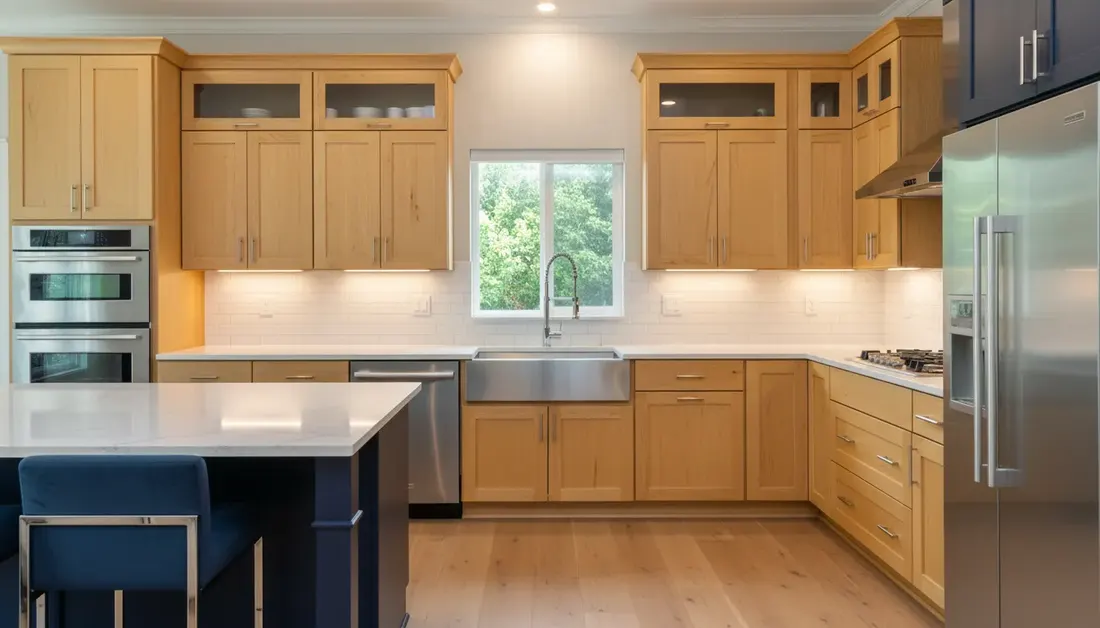
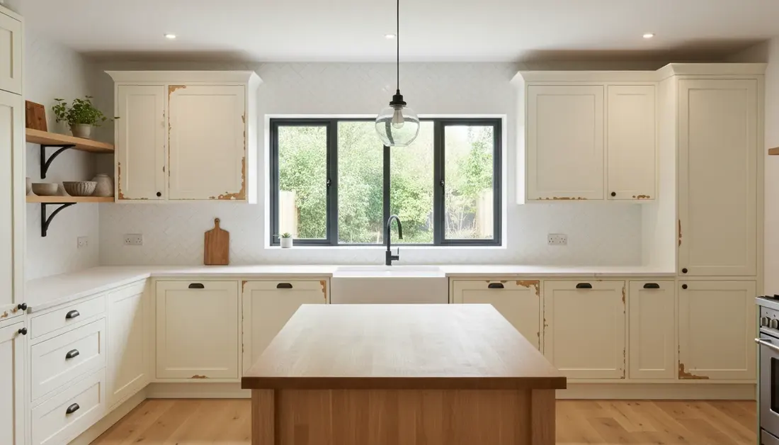
Every neutral leans somewhere. Warm undertones lean yellow, red, or beige. Cool undertones lean blue, green, or grey. A white counter with grey veining pairs with a cooler white or a blue-grey. A beige or speckled brown granite pairs with warmer whites, creams, and greens. When cabinet and counter undertones fight, both look dirty.
A quick test: hold a sheet of plain printer paper against the counter, the backsplash grout, and the floor. Whatever looks yellow, pink, or blue next to the paper shows you which way that surface leans.
Decide which surface leads
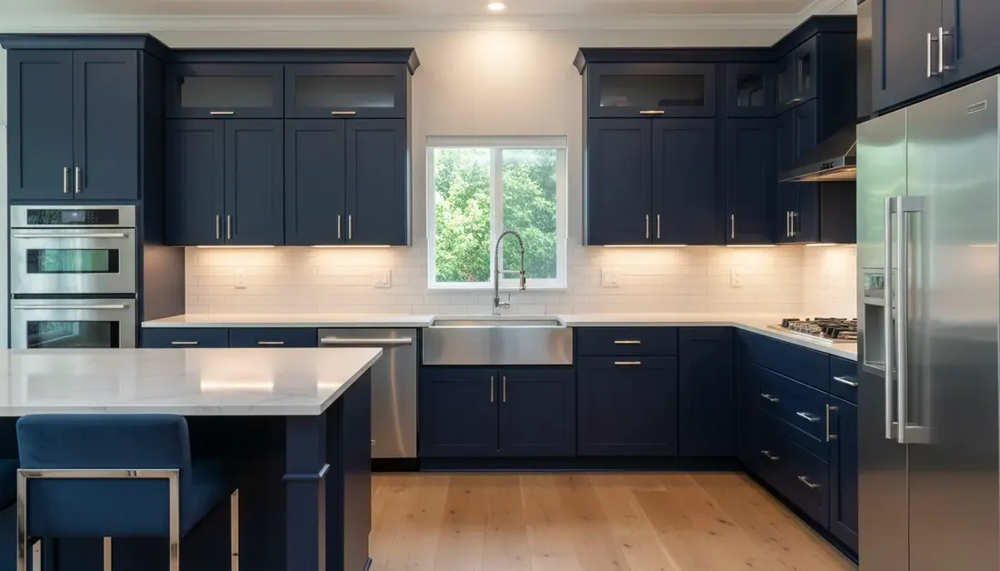
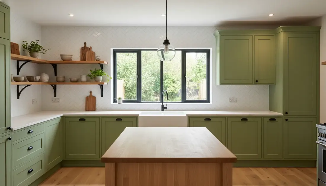
A busy granite or patterned tile already carries the room, so a quiet cabinet colour lets it show. A plain quartz counter and a white subway backsplash leave room for a stronger colour such as navy or green. Warm wood floors, common in older Sherwood Park and Edmonton homes, usually sit well beside soft whites, sage, and deep blue.
How light and room size change a cabinet colour
The same paint can look like two different colours in two kitchens. Daylight shifts through the day, and warm bulbs push colours toward yellow. Edmonton-area winters bring short days, so many kitchens spend more waking hours under electric light than daylight. Judge a colour under both.
Light Reflectance Value (LRV) helps here. LRV rates how much light a colour reflects on a scale from 0 (black) to 100 (white). Benjamin Moore lists Cloud White OC-130 at an LRV of 85.05 and Hale Navy HC-154 at 8.36. The contractor who completes every job cites both as colour examples for honey oak conversions. A high-LRV white bounces light around a small or dim kitchen. A low-LRV navy absorbs it, which reads as rich in a bright room and heavy in a dark galley.
- Small or dim kitchens: light colours on the uppers keep the room open. A darker colour can still work on the lowers or the island.
- Large or bright kitchens: deep colours on every cabinet are easier to carry because the room has light to spare.
- Open floor plans: the cabinets are seen from the living room, so check the colour against the wall paint and furniture there too.
Light vs dark cabinet colours: what to weigh
No cabinet colour hides everything. Light and dark finishes simply show different things, so pick the trade-off that suits how your household uses the kitchen.
| Colour direction | Example | Pairs well with | Tends to show |
|---|---|---|---|
| Soft whiteHigh LRV | Benjamin Moore Cloud White OC-130 | Small or dim kitchens, warm wood floors, most counters. | Fingerprints and cooking residue near handles. |
| NavyLow LRV | Benjamin Moore Hale Navy HC-154 | Bright rooms, white or pale counters, brass or black hardware. | Dust, lint, and chips that reveal a lighter layer. |
| SageMid tone | Colour direction to explore | Warm wood, cream tile, natural stone. | Less contrast with everyday marks than either extreme. |
| EmeraldDeep tone | Colour direction to explore | White counters, an island accent, open shelving. | Similar to navy, in a warmer look. |
| Matte blackVery low LRV | Colour direction to explore | Large, bright kitchens and light counters. | Dust and oily prints, which a flat sheen shows readily. |
Colour choice does not change the cost or the prep. For how long a finish holds up in daily use, read how long painted cabinets last.